Quantcast
Channel: Calculated Images
Viewing all 70 articles
Browse latest View live

Monroe, Einstein and Visual Acuity

$
0
0
The recent Mirror newspaper advert in the UK has brought a classic optical illusion back into the public eye; a hybrid image of Marilyn Monroe and Albert Einstein which, up close, looks like Einstein but from further away, or with squinted eyes, looks like Marilyn.


Try it out! From close up Einstein's trademark hair and moustache jump out, but squint or stand back from the screen and you can see a classic shot of Marylin's curls, eyelashes and smile. A version of this illusion was first made by Aude Oliva for a feature in New Scientist, and it is a really striking example of a hybrid image illusion.

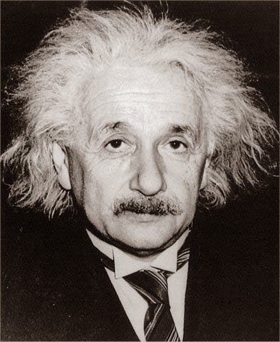
So what is your brain doing? And how can you make an image like this? Making an image is actually quite simple. First of all take pictures of these two pop icons with similar(ish) lighting and align them so their main features (eyes, mouth, overall face) are at the same size and position in the images:


The trick is then to to use a Fourier bandpass filter to filter out low frequency structure in the Einstein image, and filter out high frequency structure in the Marylin image. You can find Fourier bandpass filters (sometimes called FFT filters) for many image editing programs.

So what is a Fourier bandpass filter? Without diving into too much maths it is a way of separating out information based on its wavelength. Filtering out low frequency structure in an image leaves only the short wavelength features, i.e. fine lines and sharp edges, while filtering out high frequency structure leaves only the long wavelengths, i.e. the general brightness of different parts of the image.

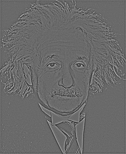
 Einstein with a <5px bandpass="" filter="" fourier="" p="" wavelength="">

 Marylin with a >10px wavelength Fourier bandpass filter5px>

Fourier bandpass filters are easier to intuitively understand with sound rather than an image. It might help to imaging using a Fourier bandpass filter on some music; a low frequency (long wavelength) bandpass filter would leave only the bassline and bass drum, while a high frequency (short wavelength) bandpass filter would leave vocal lines and high pitched instruments and drums.

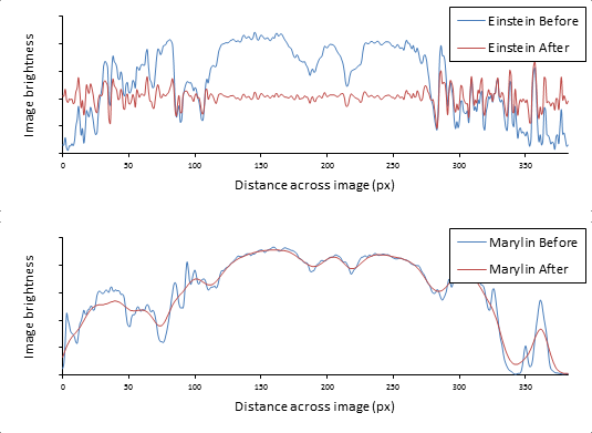
If you are more mathematically minded it might be useful to imagine this through some graphs. These are plots how bright the image is as you go along a line across the middle of the two images. It is easy to see that the filtering of the Einstein image only leaves the short wavelength data, and the filtering of the Marylin image only leaves the long wavelength data:


You can also imagine a long wavelength Fourier bandpass filter as a blurring, and a short wavelength Fourier bandpass filter as the inverse of blurring; grabbing the details that are lost when the image is blurred.

Having made the two Fourier bandpass images it is simply a matter of averaging the two together to get the final product:


So how does it work? The trick is simply based on a limitation of how well you can see. From a greater distance your eyes are less able to see the fine detail of the image, so your brain interprets only the big structures. In this case this leaves your brain to latch onto the Marylin part of the image, helped by the fact that many of her photos are extremely recognisable.

From closer in your eyes can now resolve the fine detail in the image, and your brain does its best effort at interpreting a slightly messy image. Because both the photo of Einstein and Marylin are kind of similar (light skin on a dark background, with big hair) your brain can do a decent job of merging the fine detail of Einstein's face onto the general light and shadow of Marylin's face.

By switching the filtering of the two images you can get the reverse effect...


... although I do find Marylin's teeth in this photo quite terrifying!

Software used:

Cheeky

$
0
0

Human cheek cells are a classic subject of school microscopy. It is easy to collect some by gently scraping the inside of your cheek. This is a high resolution phase contrast image of one of my cheek cells, put together using focus stacking of a 4 by 4 montage of 57 focus slices using one of my ImageJ macros. The detail of the nuclear structure, the granular contents of the cytoplasm and the structured surface of the cell really jump out.

This cell is quite large for mammalian cells, about 75 μm across, and around 10 times larger than the single cell Leishmania parasite I currently do much of my research on. If you have sharp eyesight you can even see human cheek cells by eye (although only just) when they are spread on a slide.

Like most mammalian cells, cheek cells are essentially transparent. If you use a microscope in the most basic way, essentially as a giant magnifying glass, shining light straight through the sample towards your eye, you see something like this:

Bright field micrograph of a human cheek cell.

This picture has even had the contrast artificially enhanced. Practically it is tough to even find the cells on the slide and get them in focus!

For many years the best alternative was oblique or dark field microscopy. Here you deliberately avoid shining light straight through the sample, and instead make sure that only light scattered by structures in the sample can collected by the objective lens and get up to your eye.

Dark field micrograph of a human cheek cell.

Images by dark field microscopy can be hard to interpret, and are typically limited to fairly low resolution.

More complex methods based on interference of light travelling through the sample were developed in the 20th Century. These methods, phase contrast and differential interference contrast, were a revolution. They allowed completely new approaches for looking at the biology of cells, particularly live cells and dynamic processes like cell division. They were such a revolution that the inventor of phase contrast microscopy, Frits Zernik, was awarded the Nobel prize in Physics in 1953 for this work.

Phase contrast micrograph of a human cheek cell.

DIC micrograph of a human cheek cell.

It was not until the development of the famous green fluorescence protein, for fluorescence microscopy in live cells in the 1990s, that there was another discovery which improved the capacity for live cell microscopy to the same extent as phase contrast and DIC.

Software used:
ImageJ

Cells and Worms - 1. The Theory

$
0
0
If you scatter 100 worms on a patch of soil 1 meter by 1 meter how many worms will fall on top of another worm? This might seem like a really pointless question, but it is surprisingly relevant to biological research using microscopes. It's also a surprisingly hard question to answer because worms are very wriggly! However, even this dry, theoretical, research problem provides the tools for making fun illustrations...


My work involves a lot of automated image analysis; taking a picture from a microscope and automatically analysing it to extract scientific data. To make sure an automated analysis is reliable you have to think about all the likely problems that might turn up, and with cells and microscopes a common problem is when two cells are lying on top of each other. The problems this causes are easy to imagine; if there are two cells with one nucleus lying on top of each other then it might look like one cell with two nuclei.

For some types of cells it is quite easy to work out how likely two are to touch or lie partly on top of each other when they are scattered randomly over a microscope slide. An example of an easy case is where all cells are circular and the same size; the approximate calculation is quite simple. Unfortunately the cells I work on are more worm-like in shape, about 17 microns long and 2 wide... if you scatter these cells over a slide how many will end up touching?

To work out the answer simulation is vital; the maths is just too complicated to do it analytically. A simulation of worm-like shapes proved to be quite simple:
  1. Pick a random starting point, direction and curvature.
  2. Start drawing a curved line from that point.
  3. Occasionally re-randomise the curvature.
  4. Stop once you have reached the length of the cell.
  5. Draw the profile of the cell shape along that curve.
Following these simple rules and tweaking the parameters (e.g. the minimum and maximum curvature, frequency of randomising curvature, etc.) gives a simple algorithm for drawing a worm-like shape. With a bit of tweaking it could draw cells that look like trypanosomes. Using this drawing tool it was possible to measure the chance of a cell touching or lying on top of another cell already on the microscope slide. Just repeat the drawing process thousands of times and detect whether the newly drawn cell intersects with any previously drawn ones. Problem solved.

This process gave me the answer I needed, but it also provided a tool for drawing trypanosome-like shapes. Better than that, it was easy to adapt it to make sure no two cells overlapped and they fitted neatly together over the image... And just like that a dry, theoretical, research problem turned into a beautiful image:


This was also easy to adapt to other worm-like shapes, like earthworms:


Software used:

Cells and Worms - 2. The Shirt

$
0
0
Last post I talked about how seeing how many worms overlap if you drop them on a patch of ground, how (somehow) this was vaguely related to my scientific research, and that the simulation of this process even generates quite nice pictures. If you thought that was geeky, then this takes geekyness to a whole new level!

Part of my research has been into the shapes of trypanosome parasites. Trypanosomes that cause disease in people are fairly widely known (you might have heard of sleeping sickness, Chagas disease, or leishmaniasis) but trypanosomes don't just infect people. Trypanosome species have also been found infecting animals from sharks to penguins, crocodiles to elephants. There is even one species named after Steve Irwin (the crocodile hunter) that infects koalas!

A scanning electron microscope image of Trypanosoma brucei, the trypanosome which causes sleeping sickness.

In short, I did some research to test whether there were particular characteristic shapes of trypanosomes (length, width, etc.) that look like they might help the parasite survive in the bloodstream of different host animals. I made a big database of properties of trypanosome shape and, using the scripts I made to draw nicely tesselated trypanosome shapes I talked about in the last post, I put together a compelling summary of just how varied trypanosome shapes from different host species are are:


The science behind this picture suggests some interesting adaptation to help the parasites swim within their host bloodstream, but that's enough about the science. To me this pattern was just begging to be on a shirt, an abstract design with a biological twist!

Spoonflower is a fantastic online service where you can order customised fabric, wallpaper and other prints. So that is exactly what I did, and after some sewing (that I didn't do myself) I am now the proud owner of the world's only 100% scientifically accurate trypanosome shirt, featuring 27 different trypanosome species.


Scientists always say that research can take you down unexpected paths. This path from wriggly worms, through an image generating script, through research into trypanosome shape, to the world's only trypanosome shirt was quite an unexpected one!

Software used:
ImageJ: Automated trypanosome drawing.
Inkscape: Conversion to vector graphics for printing.

Tree of Plants

$
0
0
Everyone knows what plants are like; they have leaves and roots, flowers and seeds. Or do they? All of these classic features of plants are actually relatively recent developments in plant evolution. Conifers don't have flowers, ferns don't have seeds or flowers and moss doesn't have leaves, roots, seeds or flowers! Leaves, roots, flowers and seeds are all features that evolved as plants adapted, starting at something like seaweed, to life on the land.

This term's issue of Phenotypehas a bit of a focus on plants, and my research comic for this issue focuses on how plants evolved and adapted to land. You can download a pdf of this feature here, the full issue for the summer (Trinity) term will be available soon here.


While I was making this I started reconsidering just what the plant life cycle looks like, as a classic school education about how plants reproduce isn't very accurate! The classic teaching is that the pollen produced by a flower is like sperm in mammals (and humans), and the ovum in the flower is like the egg in mammals. In fact pollen and the developing seed are more like small haploid multicellular organisms, gametophytes, that used to be free living. If you go back through evolutionary time towards ferns then the gametophyte is a truly independent multicellular organism. Go back further still and the bryophytes spend most of their time as the gametophyte.

If you imagine the same evolutionary history for humans then it is easy to see how different this life cycle is to animals; if the ancestors of humans had a life cycle similar to ferns then, roughly speaking, ovaries and testicles would be free-living organisms that sprout a full grown human once fertilisation successfully occurs. I can't help but think that would have been a little strange!

Software used:
Autodesk Sketchbook Pro: Drawing the cells.
Inkscape: Page layout.


A Year in The Life of a Computer

$
0
0
What does a year in the life of a computer look like?


Well, something like the map below! This is a map every bit of of mouse movement, every mouse click and every keyboard press I have done on my home and work computer over every day of a whole year.


2013-2014 [click for a bigger view]

To make it I wrote a little python script using pyHook to grab inputs in Windows, which I compiled to an .exe using py2exe. I set this up so that it starts recording the mouse movement, clicks, and keyboard presses after I log into my home or work computer. After 2 years it had collected nearly 10 Gb of data! This was far too much to look through by hand, so I wrote a second set of scripts to plot it to an image.

So what does it all mean? Well the map breaks down a bit like a normal calendar, with days of the week running from the top to the bottom of the map, and successive weeks running from left to right. The years and months are marked at the top of the map.


Within each day my computer activity is broken down by time. Time runs from the top to the bottom of each day, from midnight to midnight. Coloured speckles on the dark background indicate computer activity. It is easy to see that I use computers a lot, with a chunk of time from around midnight to 7 am when I am normally asleep, then smatterings of activity from around 8 am to midnight when I am at work or awake at home.


Different types of computer activity are shown in different colours.


The structure within each of the colours also contains information; distance in the horizontal direction corresponds to horizontal mouse position across my two screens (for mouse movement) which mouse button was clicked (for mouse clicks) and which key was pressed (for keyboard presses).

2012-2013 [click for a bigger view]

In these maps of usage some interesting structures jump out; you can spot the type of work I was doing with my computer based on the type of mouse and keyboard activity:


This is usage on a day where I was writing my PhD thesis. The keyboard (cyan) has loads of activity, while the mouse (magenta) did relatively little.


This is a day where I was mainly using Blender for 3D graphics. The mouse (magenta) has huge levels of activity, centred on just the left hand screen). The keyboard is hardly active except for the control and shift keys, which light up as a single column of bright cyan pixels.

It is quite scary how much information can be gleaned from these maps of computer activity. Without knowing which programs were open or which keyboard keys were being pressed it is still easy to work out where I have been, when I have been working, and the kind of things I was doing on my computer. Similar data can be collected remotely; particularly if an internet company tracks when and where you use the internet.

Stop for a second and think about the companies you interact with, and the data mining they can do. Think how much they can learn about you and your habits; Google and the websites you visit, your phone company and when and who you text and call, the supermarket you shop in and what you buy. These companies can work out what you are interested in, what you like and dislike, when you are awake and when you are asleep. This is big data, and it is valuable and it is powerful. Big data is how Target knew a man's teenage daughter was pregnant before he did!

Software used:
pyHook and py2exe: Data logging.
ImageJ: Data plotting.
Inkscape: Plot annotation.

Jurassic Wedding

$
0
0


You will have seen the instant internet classic of a dinosaur crashing a wedding... I got married this year and just had to do the same. Fortunately my wife agreed! I am a biochemist, but cloning a dinosaur to crash my wedding would have been a bit of a challenge, so I had to stick to the graphics approach instead.

So how do you get a dinosaur to crash your wedding?

Step 1: Recruit an understanding wedding photographer and guests for a quick running photoshoot. Make sure everyone is screaming and staring at something imaginary!


Step 2: Recruit a dinosaur. A virtual one will do, and I used this excellent freely available Tyrannosaurus rex model for blender.


Step 3: Get some dynamic posing going on! Most 3D graphics software uses a system called 'rigging' to add bones to a 3D model to make it poseable. This is exactly what I did, and with 17 bones (three for each leg, seven for the tail, two for the body and neck and two for the head and jaw) I made our pet T. rex poseable.

 The bone system

The posed result

Step 4: Get the T. rex into the scene. By grabbing the EXIF data from the running photo I found that it was shot with a 70mm focal length lens. By setting up a matching camera in blender and tweaking its position I made the camera position match perspective between the view of the T. rex and the running people.


Step 5: Making the dino look good. A 3D model is just a mesh of points in 3D space. To get it looking good texturing and lighting need to be added. For this project they also need to match the photo. Matching the lighting is particularly important, and I used Google maps and the time the photo was taken to match up where the sun was as accurately as possible.

The T. rex wireframe

Textured with a flat grey texture.


With a detail bump texture and accurate lighting.

With colours, detail texture and lighting.


 Step 6: Layering it all together. To fit into the scene the dinosaur must sit into the picture in 3D; in front of some object and behind others. To do this I just made a copy of some of the guests which need to sit in front of the dinosaur and carefully cut around them. The final result is then just layering the pictures together.


So there you go! 6 steps to make your own wedding dinosaur disaster photo!


Software used:
Blender: 3D modelling and rendering.
Paint.NET: Final layering of the image.

PixelTool

$
0
0
Many classic games like Transport TycoonRollercoaster Tycoon and Theme Hospital have pixel art graphics using a limited number of colours. These graphics are tricky to draw and take a lot of skill, especially when trying to draw accurate 3D shapes from different angles and getting the perspective and shading right.

So I made PixelTool to help out!


What is PixelTool?

PixelTool is an online voxel-based tool for drawing isometric pixel art graphics. To use it you modify a 3D volume of voxels; picking 8-bit colours for each of the voxels and leaving the background as the 'magic blue' which is transparent.

It takes the voxel data and does a pixel-perfect rendering of it into 3D and adding lighting and shadowing, but still sticking to the starting 8-bit colour palette.

Slices through the voxel data of a piece of heavy hauling equipment for OpenTTD

The corresponding rendered image of the voxel block.

Blowing up the voxels in the rendered image by 4 times lets you see what is going on in a bit more detail:


PixelTool isn't just a cheap imitation of 3D rendering software, it is a dedicated tool streamlined to making isometric sprites for classic 8-bit games.

Want to play some more?
Test PixelTool out online here: http://www.richardwheeler.net/interactive/pixeltool.html
Grab the source HTML/javascript code here: http://dev.openttdcoop.org/projects/pixeltool
Download this example of voxel data here: www.richardwheeler.net/hosting/voxeldata.txt
Join the discussion here: http://www.tt-forums.net/viewtopic.php?f=26&t=69974&start=60


3D Lightning 2

$
0
0
About a year ago two redditors happened to take a photo of the same lightning bolt, but from different places, and I use them to make a 3D reconstruction: 3D Lightning.

Well, it happened again!
The two source images.

This time the lightning bolt struck one World Trade Center (Freedom Tower), and two people got a shot of it from over the river. A little adjustment for the rotation of the image and some guestimation of their approximate locations let me work out that there was very little vertical shift between their locations, but quite a large horizontal shift.

Just like last time, a 100% accurate reconstruction isn't possible. You need to know the exact locations and elevations of the people, and field of view of the cameras used, to do this precisely. However, just like last time, a rough reconstruction is possible where the difference in horizontal position of part of the lightning bolt between the two images is proportional to the distance from the people taking the photos.

The approximate 3D reconstruction.

After grabbing the coordinates from the photos it was just a matter of plugging them into Blender to make an approximate 3D reconstruction.

Software used:
ImageJ: Image analysis.
Blender: 3D modelling and rendering.

3D Wood Grain

$
0
0
Using a block of wood and a plane Keith Skretch made something amazing. He snapped a picture of the wood, then planed a thin layer off, snapped another picture, planed another layer off, and repeated this hundreds of times. In the resulting timelapse/stop motion video you fly through the wood structure, and can see knots and grain in the wood ripple by.


Waves of Grain from Keith Skretch on Vimeo
To my computational image analysis eyes, the truly amazing thing about this video is contains the detailed three dimensional map of the internal structure of blocks of wood; that these blocks of wood have been digitally immortalised!
Let's look at just one of the blocks of wood:
 The series of images 29-36 seconds through Waves of Grain

So what can you do with this data? Well you can reproject to give you a virtual view of what the left and the front sides of the blocks of wood would have looked like:

That's quite cool, but doesn't capture the power of having the full 3D information. The more powerful thing you can do is do a virtual cuts through anywhere you want in the block of wood. You can cut it somewhere in the middle to take a look at the internal structure... The yellow lines mark where the virtual slices were made:
That's also quite cool, but still doesn't capture the power of having all that 3D data. You can also reslice the image at any orientation that you want; it doesn't have to be neat orthogonal lines:

Again, quite cool. But you can still do more. Because this is now a purely digital representation of this block of wood you can display it in ways that would be physically impossible to make. Instead of just looking at the outside of the block...


... you can now look inside.


This 3D reconstruction lets you see how the growth rings appear in three dimensions, showing exactly where the grain runs. It lets you see how the knot, which is where a branch grew from the tree, cuts through the growth rings in a distinctive way. It lets you see pretty much everything about the internal structure of the wood!

This kind of approach is used all over biology, and is normally called something like serial sectioning. You can use it for everything from reconstructing a whole person by histology and a light microscope to a single cell by electron microscopy.

Software used:
ImageJ: 3D reconstructions

This one goes out to the cilia biologists...

Tides

$
0
0
Ocean tides are one of the most amazing but overlooked natural wonders of our planet. As the Earth rotates relative to the sun and the moon, their gravity drags the Earth's water about, raising and lowering it in synchrony with the heavens. The importance of tides reaches further than just surfing, sunbathing and shipping: Tides are the reason the moon is drifting away from the Earth at 3.8 cm per year. Tides allow the formation of beaches with rock pools at low tide, that some biologists argue helped the evolution of early life. Tides (of the atmosphere) are the reason a satellite in a low orbit is more likely to burn up on the side of the Earth nearest or opposite to the moon. Tides even influence the time  earthquakes happen.

The explanation of why tides happen is classic high school geography/physics. The gravitational pull of an object is felt more strongly by something close to it. In the case of the Earth, this means that the oceans on the closest side of the Earth to the moon feels a stronger gravitational pull than the Earth as a whole, and the oceans on the far side feel a weaker pull. This means that the oceans on the near side of the Earth are pulled into a bulge (a region of high tide) and the oceans in the far side are also flung outward into a bulge (another region of high tide). This causes high and low tides twice per day. Throw in the similar contribution of the sun's gravitational pull, and it also explains spring tides around the time of the new and full moon.

Of course this is all a bit of a lie to simplify things. Many places have one  high and low tide per day, and a few places even have four. Some places have barely any tide, while others have very large tides where the water level can change by many metres. Why? Because the land gets in the way! It is impossible to have a bulge of water where Africa is, even if the moon was directly over the Sahara. So what does the pattern of tides actually look like?

Something like this:


[Watch in HD on YouTube]

This animation shows sea levels over the course of one day, where orange represents high water level, and blue represents low water level. Instead of the water levels changing because of two big bulges of water, there are instead complex patterns of water level change.

So, how does the simple rotation of the Earth relative to the sun and moon generate such complexity? It is easiest to think about the oceans as containers of water which gently slosh about as the water gets pulled by the gravity of the sun and moon. It is a bit like the sloshing of water you get carrying a glass of water, or when you climb out of a bathtub. The precise pattern of the sloshing depends on many things; the strength and direction of the gravitational force driving the sloshing, the depth of the water, and how the oscillating sloshing movement resonates when it gets trapped against the coastline.

The different water movements that make up the final tidal moment can be broken down by the force that generated them (the sun, the moon) and their frequency (once a day, twice a day). The two biggest contributing movements are a twice daily movement arising from the moon, and a once daily movement due to the combined action of the sun and moon.

These individual movements are mapped through their amplitude (how much the water changes height) and their phase (the relative time of high tide). These maps are surprisingly beautiful! Here are a couple of examples:


These are the patterns of movement of the "M2" part of tides, which is a twice daily water movement arising from the primary action of the moon's gravity. Brightness represents the amplitude, from black (zero amplitude) to white (5 metres amplitude). The coloured lines are a bit more complex. They represent the places where the highest water level occurs due to the M2 tidal component at different times, from red (at 0 hours) through the colours of the spectrum at 1 hour steps.


These are the patterns of movement of the "K1" part of tides, which is a once daily water movement arising from the combined action of the sun's and moon's gravity. Again, brightness represents amplitude, but the amplitudes are smaller and white represents only 2.5 metres. The coloured lines represent the time when highest water level due to the K1 tidal component occur, but this time separated by 2 hour steps.

These are just the two largest components of tides, there are many complex contributing factors: M2: principal semi-diurnal lunar, S2: principal semi-diurnal solar, N2: larger semi-diurnal elliptical lunar, K2: declinational semi-diurnal solar/lunar, 2N2: second-order semi-diurnal elliptical lunar, K1: principal diurnal solar/lunar, O1: principal lunar, P1: principal diurnal solar, Q1: larger diurnal elliptical lunar. Each of these components has similarly beautiful patterns of movement.

Software used:
ImageJ: HAMTIDE tital data plotting.

Forgotten Futures - New York

$
0
0

What if cities looked like this? The 1920s view of cities of the future was glorious; huge buildings towering into the sky, multi-layer roads, rail and pavements, airships and aircraft, and the bold geometry of art deco.

Sadly this world never came into existence. But what if it had? What would 1950s New York have looked like? I re-imagined this forgotten future based on the view from the Empire State building towards the Grand Central station and the Chrysler building in a world where the 1920s vision of the future came to be.


Software used:
Blender: 3D modeling, texturing, rendering, compositing.
Paint.NET: Final image tweaks.
Inkscape: Texture detailing.

Building a forgotten future; 7 days of 3D modelling in 20 seconds:


Trypanosome Lego

$
0
0
Trypanosomes and Leishmaniaare the two tropical parasites that I do most of my research on. These cells seem to have a lot of modularity in controlling their shape, and have quite a lot of flexibility in reshuffling where particular structures (made up of many organelles) sit within the cell.

The base of the flagellum, the whip-like tail which the cell uses to swim, is also the site where the cell takes up material from its environment (essentially its mouth) and is linked with the Golgi apparatus (an important organelle in protein processing) and the mitochondrion (the powerhouse of the cell) and links to the mitochondrial DNA. It turns out reducing the level of just one protein in the cell can cause this entire complex structure to shift its position.

Cells are not quite as flexible as Lego, but it is still impressive that a single protein can have such a large effect on the organisation of a cell.

Tengwar - Transliterating Font

$
0
0
This blog post is about a Tengwar font I designed. It automatically converts text as you type into accurate Elvish script. You can download it for free here.  Just make sure you enable ligatures, contextual alternates and kerning for best results!


While writing his Middle Earth books, JRR Tolkein invented an entire alphabet for the elves called Tengwar. His attention to detail was incredible, Tengwar is a fully functioning writing system. This is the famous Elvish writing seen all through Lord of The Rings and the Hobbit.

Tengwar is an alphabet, not a language, and can be used to write many languages. This is like, for example, Latin and Greek alphabets; the word English word “ring” is normally written in the Latin alphabet but could also be written in the Greek alphabet as “ρινγ”. The two sound the same, it is just a different way of writing the sounds of the word “ring”. The process of transferring a word between two different alphabets is called transliteration.

In Middle Earth, Tengwar is one of the major ways of writing. Many languages were written in Tengwar: two Elvish languages called Sindarin and Quenya, the Black Speech of Mordor (on the One Ring), and the language of men (English). Tolkein gave detailed notes on how to write English in the Tengwar alphabet. In Tengwar “ring” is written:


Writing in Tengwar follows simple rules but quickly gets complicated, so I designed a font that does it automatically! You can download it for free here.  As far as I know this font is unique, all other Tengwar fonts are just collections of symbols you have to manually mix and match.

To use this font you just need to download and install it. Once it is installed, just select it as the font and start typing as normal. The font will automatically transliterate the text you type into accurate Tengwar, based on Tolkein’s rules about writing English in Tengwar.

To make sure the font is working accurately you need to make sure three settings are enabled: kerning, contextual alternates and ligatures. For example, in Microsoft Word you can do this through the advanced font settings:


So how does it work? Basic Tengwar is similar to the Latin alphabet, with two classes of symbols representing the sounds of different consonants and different vowels. At the simplest level, to write the word “ring” the font just selects the four symbols for “r”, “i”, “n” and “g”:


Unlike the Latin alphabet, there are special rules for how vowels are written. Instead of always being a separate letter, if a vowel comes immediately before a consonant it is written as an accent on that consonant. In “ring” the “i” comes immediately before the “n” so the font writes it as an accent on the “n”:


There are some special rules to use for some consonants, depending on where they are in a word. “r” is one of these letters. If it is followed by a vowel then it should have a different symbol, which the font automatically selects:


Finally, some common combinations of consonants that have a single sound (like “th” as in “the”, “ch” as in “church” and “gh” as in “ghost”) have their own single symbol. “ng” is one of these pairs and, again, the font automatically makes this substitution:


And that is how the font automatically writes “ring” in Tengwar. These are not the only rules though, there are also other ones built into the font that involve double vowels, double consonants, the letter “n” preceding another consonant, whether a “y” is used as a vowel or a consonant, whether an “e” is voiced in a word or is silent at the end of a word, etc.

The key feature of my font is that it takes all of these rules into account automatically and lets you simply type away as normal and get an accurate, readable result in Tengwar. You can also just select an existing chunk of text and apply the font to it to transliterate it to Tengwar, but make sure the text is all lower case for best effect. It does make a few very small mistakes, but Tolkein would understand it!

Tengwar is a beautiful and concise alphabet. The way vowels, double letters and letter pairs combine make many words very short and elegant:


The overall flow of a paragraph is also excellent, with the letters falling into self-symmetric curves and alignments.

(This is the first paragraph of Lord of The Rings, converted to Tengwar by just changing the font to my Tengwar Transliteral font.)

If you are interested in playing with Tengwar text for any kind of design please consider downloading the italic and script versions of the font here. These cost a few pounds/dollars/euros.

If you are interested in reading Tengwar, or manually translating it, then the excellent “Tengwar Textbook” Chris McKay is available online for free: Tengwar Textbook.

There are also excellent simple guides on writing in Tengwar (like this one), but why do that when you could just download my font and type your name?

Software used:
Inkscape: Glyph design
Fontforge: Font design

Smooth Videos - AKA Correcting NASA

$
0
0
What makes a video look smooth? Your eye is extremely sensitive to problems with videos, and for any video to look smooth it has to have:

  • A high frame rate
  • A steady camera
  • Roughly even brightness each frame

Normally these are easy to get. Any modern camera will give a decent frame rate, and the exposure time for each shot will be accurate, giving an even brightness of images each frame. Camera steadiness is more difficult, but a basic tripod will solve that.

This is a lot harder in space! For a NASA space probe floating through deep space, keeping a steady orientation is a challenge. Spacecraft can do this well quite well, using thrusters and reaction wheels. They still make some small mistakes though. Getting an even exposure time for each frame of a video is also harder in deep space, especially as it might take minutes or hours for radio commands to reach the space probe so you have to trust its autoexposure. Luckily, given ok starting material, correcting camera shake and frame brightness problems by image processing is quite easy.

NASA's Dawn space probe is currently approaching Ceres, getting sharper pictures of this dwarf planet than ever before. A series of these pictures even shows this tiny world rotating. Unfortunately, they didn't correct the shake or brightness problems in the video released to the press:


A quick fix in ImageJ to remove the shake and even out the frame brightness makes a (dwarf) world of difference:


As the probe gets closer and closer to Ceres its shots are getting more and more spectacular, but the videos still need shake and brightness correction.


Interested in improving some NASA videos? I did the corrections using the free scientific image editing software ImageJ, and these are two handy macro scripts for video corrections in ImageJ:

Image stabilisation

//Stabilise based on signal intensity centroid (centre of gravity)
//Stabilises using translation only, using frame 1 as the reference location
//This method is suitable for stabilising videos of bright objects on a dark background
for (z=0; z<nSlices(); z++) {
//For each slice
setSlice(z+1);
//Do a weighted sum of signal for centroid determination
sxv=0;
syv=0;
s=0;
for (x=0; x<getWidth(); x++) {
for (y=0; y<getHeight(); y++) {
v=getPixel(x, y);
sxv+=v*x;
syv+=v*y;
s+=v;
}
}
//Calculate the centroid location
cx=sxv/s;
cy=syv/s;
if (z==0) {
//If the first slice, record as the reference location
rcx=cx;
rcy=cy;
print(rcx, rcy);
} else {
//Otherwise calculate the image shift and correct
dx=cx-rcx;
dy=cy-rcy;
print(dx, dy);
makeRectangle(0, 0, getWidth(), getHeight());
run("Copy");
makeRectangle(-dx, -dy, getWidth(), getHeight());
run("Paste");
}
}
Brightness normalisation

//Normalise image brightness to reduce video flicker
//Scales intensity based on the mean and standard deviation, using frame 1 as the reference frame
//This method is suitable for reducing flicker in most videos
for (z=0; z<nSlices(); z++) {
//For each slice
setSlice(z+1);
//Find the signal mean and standard deviation
run("Select All");
getRawStatistics(area, mean, min, max, stdev);
if (z==0) {
//If the first slice, record as the reference signal mean and stdev
rmean=mean;
rstdev=stdev;
print(rmean, rstdev);
} else {
//Otherwise calculate the brightness and scaling correction
run("Macro...", "code=v="+rmean+"+"+rstdev+"*(v-"+mean+")/"+stdev);
print(mean, stdev);
}
}

Software used:
ImageJ: Image corrections
GIMP: Animated gif file size optimisation

Partial Solar Eclipse 2015

Light-Years of DNA

$
0
0
Light-year, and DNA. Not two scientific terms you expect to see on the same page, but over your lifetime your body will produce around one light-year of DNA! That is about one trillion kilometres. Don't believe me? Let's do some maths:

Every cell in your body has two copies of your genome, held in 23 pairs of chromosomes. The human genome is approximately three billion (3×10⁹) base pairs of DNA.

The famous double helix of DNA has about 10 base pairs per twist, and each twist is 3.4 nanometers long (3.4×10⁻⁹ metres, the same as roughly 20 carbon-carbon bonds).

This means that the total length of DNA contained in every cell of your body is approximately 2 meters (3×10⁹ base pairs multiplied by 0.34×10⁻⁹ metres per base pair, doubled because of the two copies).

Your body has about ten trillion (1×10¹³) cells (excluding red blood cells), and this remains roughly constant through your life. There is a huge turnover of these cells though, as your body replaces cells to maintain itself.

Every time a cell is replaced its 2 metres of DNA must be produced. In most tissues the cells are replaced in a couple of months, and in many they are replaced in just a couple of days. Even cells in bones are replaced every few years.

The average lifetime of a cell is probably one or two months, so if you live to 80 then your cells are replaced about 500 times throughout the course of your life.

This means that the total length of DNA your body produces in your lifetime is approximately 1×10¹⁶ metres (2 metres multiplied by 1×10¹³ cells, multiplied by 500 replacements). 1×10¹⁶ metres (ten thousand trillion metres) is about one light-year (0.946×10¹⁶ metres)! Most amazingly it would not be a light-year of random DNA sequence, but ten thousand trillion identical copies of your DNA, faithfully replicated by your cells.

References:
An estimation of the number of cells in the human body
How quickly do different cells in the body replace themselves?
Thanks to Rob Phillips for making me think about this!

Pebbling in colour

$
0
0
The Pebble Time is finally out! This fantastically simple, yet massively functional, little smartwatch is now shipping to the Kickstarter backers who pledged their renewed support to the company that produced the original Pebble.


I've been lucky enough to be beta testing a developer preview model of the Pebble Time, and have had it on my wrist for the last few weeks. I used this time to put together some animated watchfaces which make the most of the colour screen, and learn some C programming along the way!


An elegant animated watchface, with each digit built from curving paths. Animated minute transitions, and tap-triggered animation to improve readability under low light. Animations, line widths and colours can be customised.

Inspired by the watchface shown on the red Pebble Time Steel advertising images:


A fun, animated, easy to read watchface. Every minute the bubbles in the background pop, and a set of new ones appear (by default) in a new colour. Alternatively you can customsise the colour of the bubbles. Tapping or shaking the watch also triggers the animation.

Inspired by the watchface shown on the red Pebble Time advertising images:


A colourful interpretation of the classic arc watchface design, with a Pebble Time-style loading animation and dynamic colour schemes. Colour schemes and whether or not to show the second hand can be customised.


A colourful interpretation of the classic pixel array digital watchface design, with loading animations, animated minute transitions and dynamic colour schemes. Colour schemes, pixel styles and animations can be customised.


Software used:
CloudPebble: Watchface programming. CloudPebble is an online IDE for Pebble watchfaces and apps.
Notepad++: Server side HTML/Javascript for the watchface settings.

Ergodic Analysis

$
0
0
My review paper about ergodic analysis came out on Thursday. Does ergodic analysis sound terrifying? It's actually quite a simple concept and it is a powerful method for extracting information about the dynamics of a cell division cycle from a single snapshot of cells at random stages of the cell cycle.

Ergodic analysis is particularly useful if a time-lapse video is impossible, for example if the cells swim or you want to do an analysis that kills the cells.


Does this sound interesting for your research? Drop me a message: @Zephyris.

Software used:
Autodesk Sketchbook Pro: Drawing the cells.
Inkscape: Page layout.
Viewing all 70 articles
Browse latest View live